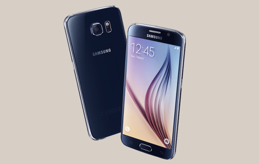
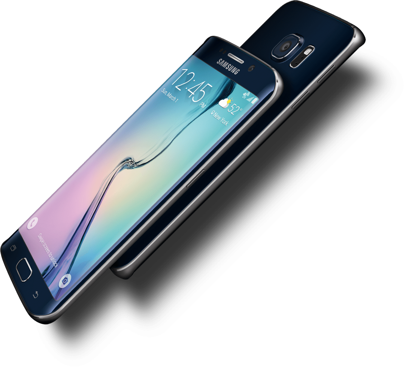
Looking at it dead on, though, the S6 is pretty plain. Your eyes will immediately get sucked into the 5.1-inch Quad HD Super AMOLED screen, but a 5-megapixel selfie camera sits above it while the Home button lies below, flanked by discrete Back and Recent Apps keys. High on the S6’s back is a squarish plateau that houses the 16-megapixel camera, and to the right lies a tiny black divot where the LED flash and heart rate sensor live. Unlike the crater that marked the Galaxy S5’s back, the assembly here is almost flush with the S6’s rear. It’s a small touch, but it makes taking heart rate and blood oxygen readings in S Health quite a bit easier.
Really, it’s details like these that speak most loudly to Samsung’s new design philosophy. Let’s put aside for a moment the fact that Samsung traded its trademark plastic bodies for sturdy metal frames and Gorilla Glass 4 panels lining the S6’s front and back. What’s more important — and consequently harder to express in words — are the little touches that tie everything together. The S6’s rounded sides are punctuated by a flat edge for your fingers to rest on. The gaps between the metal and Gorilla Glass are so fine as to be imperceptible. The sole speaker has been moved to the phone’s bottom so you’re not blasting tunes straight into your desk. We could go on, but the S6 just feels seamless in a way its predecessor never did.
#MM REVIEW POINT
The S series should be reconsidered by Samsung and considering a different model before they loose consumer on the S trend. Android phones are getting too similar in design and interface and it is slowly becoming too obvious to the consumer. This phone is not on a low-budget phone but however stands as a great contender in the Android phone market. S6 is awesome and works perfectly, it would be a great buy for fans of the S series.


